Limbing Up the Old Sweet Gum
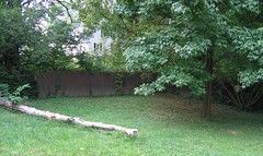 You've heard me moan about the north corner before. It's damp and wet. (The lowest point of the yard is just to the left of the tree.) I doubt I can improve upon the present french drain system, so I will live with the corner's seasonally soggy state and plant appropriately. I can do something about the shade. This fall, Mike whacked some of the overhanging limbs from the neighbor's locust tree to let in more light. I decided to limb up our tree months ago, but, with a great deal of difficulty, forced myself to wait until the proper time.
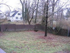 Somewhere in the internet's vast expanse, I read that trees should be pruned when they're dormant in order to reduce stress and the chance of infection or even death. This means waiting until not only the leaves have fallen, but we've been through a few hard freezes. I disregarded these rules when I pruned the honeysuckle trees, because if they become stressed and die, I'll be glad. Our big shade tree is an investment, though, so I bided my time and trimmed the lower branches during a warm spell just after Christmas.
 Not only have I increased the amount of sunlight my future secret garden gets, but I also managed to identify the tree. Where I grew up (Pacific Northwest) if a tree was deciduous and had lobed leaves, it was a maple. Here in the Midwest, that method of identification doesn't work as well. I was ignorantly sure that this tree was a maple until my kitties started attacking the spiny balls dangling from the detached limbs. I consulted Trees of Ohio, and identified the tree as a sweet gum. Because the tree was dormant, my cuts didn't produce any of the fragrant, sweet resin that was once used as chewing gum. Apparently the leaves are also aromatic when crushed, but I'll have to wait until spring to try it for myself. Sweet gums are one of the cidaca's favorite hosts and the limbs of my tree show heavy cicada damage (probably from summer 2004).
So, I got organic cat toys and a little education out of the pruning experience. Not bad for yardening in December.
