Honey, the Hallway is Orange
To warm and brighten our stark white hallway, I planned on copying this golden harlequin paint treatment from one of my decorating books:
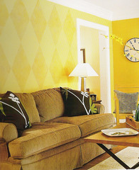
Instead, it looks as if this happened:
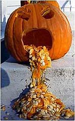
So, how did I end up with pumpkin puke walls? By throwing caution to the wind and choosing my paint colors at the store.
My normal paint selection process consists of me bringing home no fewer than 10 sample cards and taping them to the wall. Next, I observe them under various lighting conditions for a week or two. I hold room accessories against the chips to be sure that the colors are complementary. Finally, after much deliberation, I make a second trip to the big box store and purchase the paint.
This time, I began my regimented method by choosing several paint cards and placing them in my cart, but, in my hurry to escape the cold night air, the cards never made it into my car. When painting day arrived, I was eager to begin and rushed to the big box, gave the cards a cursory glance, and chose two colors that seemed to be a warm gold. After the paint was mixed, I was given the routine preview, and the paint seemed rather orange, but I figured the store lighting was just off.
When I got the paint home, it still seemed closer to orange than gold, but I thought it would look different on the wall. I was wrong. It seemed more and more orange the more I painted. I finished the first coat and frowned. I thought a second coat might change my perception, but the color only intensified. I still thought that my eyes were deceiving me (surely the walls were golden, not orange), so, when Mike arrived home from a long day of studying for finals, I presented him with our pumpkin hallway.
Not only did he think it was, indeed, orange, he said it was “awful.” This is quite a criticism from a man who didn’t bat an eye when I bought a truly orange couch, painted the dining room asparagus green, and furnished our guest room in teal, fuschia, and purple. He then compared our house to WILLY WONKA'S CHOCOLATE FACTORY. At this point, though, I had invested so much time and energy into the paint that I had to defend it. I rationalized that it would look better when the white trim was freshened. While harlequin diamonds were definitely out at this point (the second color turned out to be a shade I’ve renamed “squash shit”), I thought I could mediate the effect of ALL THAT ORANGE, by painting an Indian-african-inspired border along the top edge of the wall. Finally, I figured that once the wall decorations were rehung, the orange walls would fade into the background.
I’ll let you be the judge of whether fresh trim, a decorative border, and wooden wall accessories complete the look or just poorly disguise it. Personally, I’m pretty happy with the color now. It is warm and welcoming. I don’t even think the transition from green dining room to orange hallway is jarring (because pumpkin and asparagus go together, right?). Although the photos may come across as a bit dark (I used no flash in order to capture the true color), the hallway does not lack for light. I am seriously considering painting over my kindergarten-caveman-inspired border and toying with the idea of harlequinning the wall with the masks (with the squash shit color I used to paint the border). I’d love your feedback.
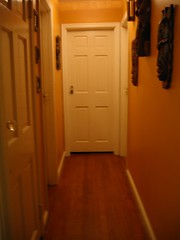
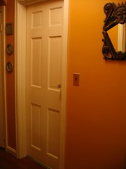


Instead, it looks as if this happened:

So, how did I end up with pumpkin puke walls? By throwing caution to the wind and choosing my paint colors at the store.
My normal paint selection process consists of me bringing home no fewer than 10 sample cards and taping them to the wall. Next, I observe them under various lighting conditions for a week or two. I hold room accessories against the chips to be sure that the colors are complementary. Finally, after much deliberation, I make a second trip to the big box store and purchase the paint.
This time, I began my regimented method by choosing several paint cards and placing them in my cart, but, in my hurry to escape the cold night air, the cards never made it into my car. When painting day arrived, I was eager to begin and rushed to the big box, gave the cards a cursory glance, and chose two colors that seemed to be a warm gold. After the paint was mixed, I was given the routine preview, and the paint seemed rather orange, but I figured the store lighting was just off.
When I got the paint home, it still seemed closer to orange than gold, but I thought it would look different on the wall. I was wrong. It seemed more and more orange the more I painted. I finished the first coat and frowned. I thought a second coat might change my perception, but the color only intensified. I still thought that my eyes were deceiving me (surely the walls were golden, not orange), so, when Mike arrived home from a long day of studying for finals, I presented him with our pumpkin hallway.
Not only did he think it was, indeed, orange, he said it was “awful.” This is quite a criticism from a man who didn’t bat an eye when I bought a truly orange couch, painted the dining room asparagus green, and furnished our guest room in teal, fuschia, and purple. He then compared our house to WILLY WONKA'S CHOCOLATE FACTORY. At this point, though, I had invested so much time and energy into the paint that I had to defend it. I rationalized that it would look better when the white trim was freshened. While harlequin diamonds were definitely out at this point (the second color turned out to be a shade I’ve renamed “squash shit”), I thought I could mediate the effect of ALL THAT ORANGE, by painting an Indian-african-inspired border along the top edge of the wall. Finally, I figured that once the wall decorations were rehung, the orange walls would fade into the background.
I’ll let you be the judge of whether fresh trim, a decorative border, and wooden wall accessories complete the look or just poorly disguise it. Personally, I’m pretty happy with the color now. It is warm and welcoming. I don’t even think the transition from green dining room to orange hallway is jarring (because pumpkin and asparagus go together, right?). Although the photos may come across as a bit dark (I used no flash in order to capture the true color), the hallway does not lack for light. I am seriously considering painting over my kindergarten-caveman-inspired border and toying with the idea of harlequinning the wall with the masks (with the squash shit color I used to paint the border). I’d love your feedback.


11 Comments:
You have a females aversion to orange! (hmmm, someone once said this to me about the color pink!) I'll defend the orange! Remember that I wear an orange coat for my English Civil War re-enactments!
Your hall needs more color. You need some green maybe in a picture, some plants or on the lower part of the wall under a chair rail. If you don't do that then paint the ceiling.
I really like it. And I like the "kindergarten" border, too. Fun!
I like it too! we originally painted our hallway orange as well, believe me when I say your color choice looks great. I think the key word in the previous sentence is "originally" the hallway is now a very boring tan color.
I think orange and green look delicious together. I figure if any color combo is good enough for nature - the pumpkin is orange with a green stem and leaves, right? - it's good enough for me.
I like your border and in general think it looks great! I love all the other colors in your house, too. I love bold colors.
I like the border a lot.
What you might try is giving it a glaze coat in a paler color - you could do this after the diamonds, if you decide to go ahead with those.
A glaze will tone the whole thing down, and could have a good bit of yellow in it to soften the orange.
But I would live with it for a month or so, see how it grows on you. Any bold color change is jarring at first.
I agree with Jen, you could
try a technique like glazing or Doug Wilson's Venetian
plaster technique:
http://www.artgroovenyc.com/tradingspaces.html
BTW, I love colors on the walls in homes. White is so boring and tells you nothing of the people living in the house.
I like it! I agree you could use some plants to balance it out but other than that I say leave the masks on the wall along with the color
I like the orange much better than the gold in the picture. And the "squash shit" is a nice color. It complements the "pumpkin".
I agree with everyone else. The color is quite nice as is, but if you think you want it toned down a bit, Jen has a good idea.
What about painting the ceiling the squash-shit (I laughed out loud when I read that) color? The ceiling will look higher if you do cover the border in the same pumpkin.
If you do the harlequin, please post all the details of the endeavour, as I have been thinking of doing the same. I want to know how difficult it is to get those diamonds straight!
Thanks for letting us peek into your home. You are a talented decorator.
I LOVE YOUR PUMPKIN!! Awesome!!
Post a Comment
<< Home