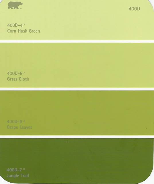
Paint card 1 of 2. I ike "grass cloth," second from top.

posted by Kasmira at 3.2.05
![]()

A bona-fide cat lady, homebody, wanna-be writer, and faux extrovert. If I'm not gardening, I'm rehearsing for a local theater production.

5 Comments:
Doh! Typo!
I "like" it.
We painted our bedroom a similar color. I dig it. My vote is for the green grass.
from Kiko (who is too lazy to sign up): The grass cloth is really appealing because it's bold and will make your red decor standout. The other samples look a little more like taupe or forest camoflage. If there's a lot of natural light that enters the room, you may want the shade darker on that same palette. Are you going to keep the trim and ceiling white?
I thought "grass cloth" was too bright at first, but it's growing on me. In comparison, the other two paint cards look muddy.
The room gets a medium amount of light. It faces NNW. The two windows in the center of the room have no window treatments (as of now). The yard is open, beyond the windows, so, other than the cardinal positioning, nothing else interferes with light.
All that said, grass cloth is about as dark as I would go. I really like "boston fern" (on a different card), but I think it would be too dark.
The funny thing about wanting to paint the room green, is that I found past traces of puke green paint in almost every room. At the time, I thought it was hideous. Everything old is new again!
Oh yeah, forgot to say that YES, we will keep the trim and ceiling white. I'm not sure if you can tell from the pics, but we have coved ceilings in the dining room. Thankfully, there is trim at the top of the walls, so we have an easy ending point for the wall color.
I love the look of green walls and white trim.
Post a Comment
<< Home